четверг, 20 сентября 2012 г.

hello-ai:strawberry-soymilk:defiancy:emilyyquachh:francis...

hello-ai:

strawberry-soymilk:

defiancy:

emilyyquachh:

francis...
:


hello-ai:
strawberry-soymilk:
defiancy:
emilyyquachh:
francisboba:
devoureth:
Okay, so I allow myself to buy one moderately priced item every 4 months as a “good behavior reward.” And since I was such a bamf this summer, I got myself a mochi machine. A MOCHI MACHINE, Y’ALL. But then I realized no one except my Asian friends had any idea what I was raving about, so, this gifset was born. [x]
oh. fuck….
I WANT ONE. 
JESUS
omg
my mothers friend has one of these.

понедельник, 17 сентября 2012 г.

Aaron Horkey

Aaron Horkey:
Aaron Horkey

Aaron Horkey is an artist and designer from Minnesota whose intricate, richly detailed images can be both beautiful and disconcerting simultaneously.
Horkey has designed and illustrated posters, album covers, skateboard graphics, magazine covers and clothing designs as well as creating graphics for reproduction as limited edition prints.
Unfortunately, he doesn’t seem to have a dedicated web presence, and his publishing company, Dead Arts Publishing, ceased production in the time since I put him on my list for a post and finally getting to writing one.
He is represented by Jacky Winter Group, and there is a gallery of his work on their site, but the images are frustratingly small, particularly given the sometimes astonishing level of detail in Horkey’s images.
One of the best sources I’ve found for his work is a series of posts on the Shrieking Tree blog, including a two part interview (and here). These include large (sometimes quite large) images of Horkey’s intricate drawings, often in their preliminary form before color is applied, that give you a much better idea of the nature of his work.
You can also find some of Horkeys posters reproduced reasonably large on OMG Posters, and a selection on Ufunk.
Horkey’s designs often include highly stylized lettering and design elements, on which as much attention is lavished as the imagery, sometimes more. The words are intricate in a way that reminds me of 1960′s psychedelic poster art, with a similar aesthetic of “if you can’t read it, you don’t get it”.

вторник, 11 сентября 2012 г.

Smaug

Smaug:
by Arnie Fenner


This Christmas Peter Jackson will release the first of a trilogy of films based on J.R.R. Tolkien's The Hobbit. (Yes, yes, it's a short book so how there are going to be three movies...we'll all have to wait and see.) Even though there are trolls and Gollum and shapeshifters and dwarves and elves, the central antagonist in the story is Smaug the Golden, Smaug the Magnificent... Smaug the Dragon.


Almost certainly inspired by the unnamed dragon—"old night-scather—who kills Beowulf, Smaug is similarly reptilian, winged, breathes fire, and jealously guards his horde of stolen treasure inside the Lonely Mountain. And just as Smaug had his roots in the Beowulf poem and other beasts from classic mythology, he in turn certainly inspired the legion of dragon villains that followed in innumerable D&D adventures and films like Disney's Dragonslayer (which itself has become the template for most contemporary filmic mosnsters).


Smaug has been the subject of numerous paintings over the years, including some outstanding examples by some of my fellow Muddies. A few examples follow.


Above: Tolkien's own painting of Smaug's coversation with an invisible Bilbo.


Above: Tim Kirk was the first artist to illustrate a Tolkien calendar; originally painted as his Masters Thesis, all of the art was purchased by Ian and Betty Ballantine for both the calendar (which sold over 250,000 copies) and for their private collection. 


Above: Greg and Tim Hildbrandt brought a realist's style to Tolkien's world with their multople calendars. This painting of Smaug was one of their best.


Above: "The Secret Thief" was one in a series of Tolkien-inspired posters Stephen Hickman painted for Christopher Enterprises in the 1970s. 


Above: Smaug was depicted a bit more mammalian with fur and a wolfish head in the Rankin-Bass animated adaptation of The Hobbit.


Above: Alan Lee's cover the illustrated edition of the novel is stunning—which is hardly a surprise.


Above: Likewise, Donato Giancola's is simply luminous—though I'd very much like to see him take his drawing of Samug, viewed from below, flying over Esgaroth to finish as an oil. I'm sure the results would be equally amazing.


Above: Similarly, John Howe's Samug sleeps atop a mound of gold that positively glows, but the coiled neck and framing wings give the painting an appropriate hint of the dragon's evil and menace. Weta turned this into an equally lovely statue.


Above: Ah, Justin Gerard. He mixes watercolors with digital refinements seamlessly to create truly astonishing works. Bilbo's tiny figure drives home the danger the hobbit is facing.


Above: Finally, an experimental graphic treatment by Shane, who describes himself as "the only Award Winning Illustrator you've never heard of." True or not, I really like this.

Как однако не просто. ХУДОЖНИК - РИСУЙ ИЗ ГОЛОВЫ!

The Dragon Empress:
-By Dan dos Santos


This past week I was extremely honored to be the Artist Guest of Honor at Dragon*Con in Atlanta, GA.


The AGoH has several responsibilities, including putting up a large retrospective of work, giving lectures, and most importantly, creating an original work of art for the cover of the Program Booklet. This piece of art is also used to make a limited run Lithograph, commemorating that year's convention.


The Artist can paint anything they want for the poster, provided it is 'dragon themed'.


Sadly, when deciding what to paint, one of my largest concerns was time. The commission is unpaid, so as tempting as it may be, it's financially unfeasible to spend a month painting a really elaborate picture. Instead, I needed to think of something I could paint quickly. I decided a portrait was my fastest option. I'm fairly facile at painting faces, and I knew I could do a good job in just a few day's time.


A dragon themed portrait immediately conjured up images of 'Dragon Royalty' and elaborate headdresses. I actually went so far as to shoot and compile reference for an alternate sketch, before deciding I didn't like it.


Above: My initial sketch, and my reference comp. The reference is composed of a mannequin head, a kneaded eraser, and my Wife's torso.


I kept a lot of the initial concept, but ultimately I decided to go with a more organic take on the portrait. I decided to make the woman herself a more obvious blend of human and dragon, rather than just a woman wearing a dragon themed headdress.


Like I mentioned, time was a concern, so I actually did the majority of work as a demo at this year's Illustration Master Class. Not only did I sketch out the concepts there, but I also photographed one of the attending students as my model. A great big "Thank You!" to the beautiful, and amazingly talented, Reiko Murakami, who took time away from her own work to pose for me.


After revising my sketch (thanks to some fantastic input from Iain McCaig, and the rest of the IMC faculty), I transferred it to the board, and jumped right into the painting.


Above: A progress shot taken during the Illustration Master Class. Note the reference comp to my left. It is assembled from photos of models, sketches, and sculptures.


I fell short of finishing the painting at the IMC by a day's work, so I put the finishing touches on it once I got back to my home studio.


Once completed, I photographed the piece and emailed the final scan to the Art Director of Dragon*Con. Their team of professionals did a wonderful job designing the Program Booklet, and Lithograph around my image. They unveiled these the night before the con, and I am happy to say the image received fantastic reviews from the attendees.


I will be offering these posters for sale next week on my website's store page. Until then, anyone who purchases one of my 'White Trash Zombie' prints will receive a 'Dragon Empress' print absolutely FREE (while supplies last).

An abandoned Japanese karaoke bar

An abandoned Japanese karaoke bar:
The very noticeable silence is a key ingredient of the whole haikyo/urban exploration experience — even more so when it’s a building more usually associated with music and laughter. A factor that makes noiseless and perfectly preserved schools especially atmospheric, and the same goes for bars with their unfinished drinks and hazy memories.
abandoned Japanese karaoke bar

Tucked away in the corner of a long-closed and sprawling spa (photos of which I’ll post in the future), this tiny bar had more than enough silence to make up for its meagre size. And remnants of possibly the last drink to be poured there almost 22 years ago to the day, hint at what the atmosphere may have been like.

abandoned Japanese karaoke bar

Then there are the empty request forms for karaoke, the bar’s bread and butter.

abandoned Japanese karaoke bar

This enka track by Kanmuri Jiro being one of the choices.

abandoned Japanese karaoke bar

A cover version of which can be heard here, which gives a fair idea of the sounds the place once reverberated to, as well as the kind of customers that used to congregate there.


In fact the names of a few them are still knowable due to the system of ‘bottle keep’. The varying degree of alcohol left in each bottle perhaps suggesting how regular a visitor they once were.

abandoned Japanese karaoke bar

Although it’s clear that some had more taste, or at least money, than others.

abandoned Japanese karaoke bar

But that was many moons ago, and where they all sat and sang is silent. Ironically now a perfect compliment to enka, with its themes of love, loss and loneliness.

abandoned Japanese karaoke bar

For the staff, however, it wasn’t just friendships to say goodbye to, but also a job, and this notebook behind the bar with its doodled おわり (the end) seems especially poignant.

abandoned Japanese karaoke bar

воскресенье, 9 сентября 2012 г.

Unblacking the Blackest Man

Unblacking the Blackest Man:
I assume everyone knows who Lucky Diamond Rich is, but if not, let me pop up a picture from one of his very first appearances on ModBlog, back in 2006, when he was already widely recognized as the world’s most tattooed man — and easily history’s most tattooed man as well.
Not only is Rick tattooed black-head-to-toe, but he’s been fully tattooed something like seven or eight times over. The white lines in the picture above are not untattooed areas. They are white ink tattoos done over top of the field of black. As these would fade slightly over time and Rick set his sights on new a body, changes would be made, sometimes with piercing or scarification, but usually with tattoos. I have made some recent posts about tattooing white ink over black and even tattooing full color over solid blackwork, and I think the time has come to update Rick’s latest stage of evolution.
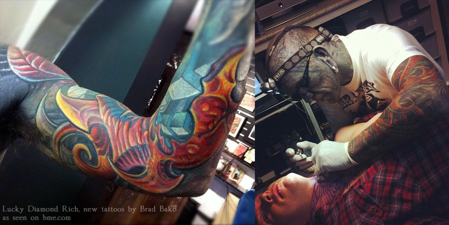
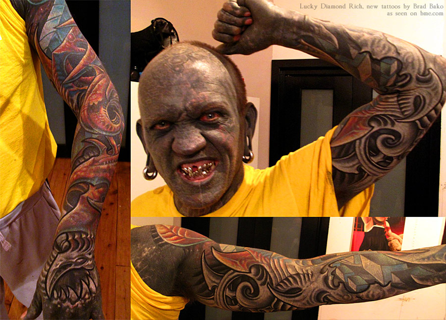
Tattooist Brad Bako has been covering up Rich’s many layers of blackwork (and more) with a new field of biomech, starting with his arm. The progress has been quite remarkable, to such an extent that many people would think it wasn’t even possible. I really want to emphasize that this is not just being done over black, but over a mottled skin filled with many layers of black, some colour, some white, and probably some residual scarring as well. What Brad Bako has achieved is quite remarkable.
luckyrich-1
luckyrich-2
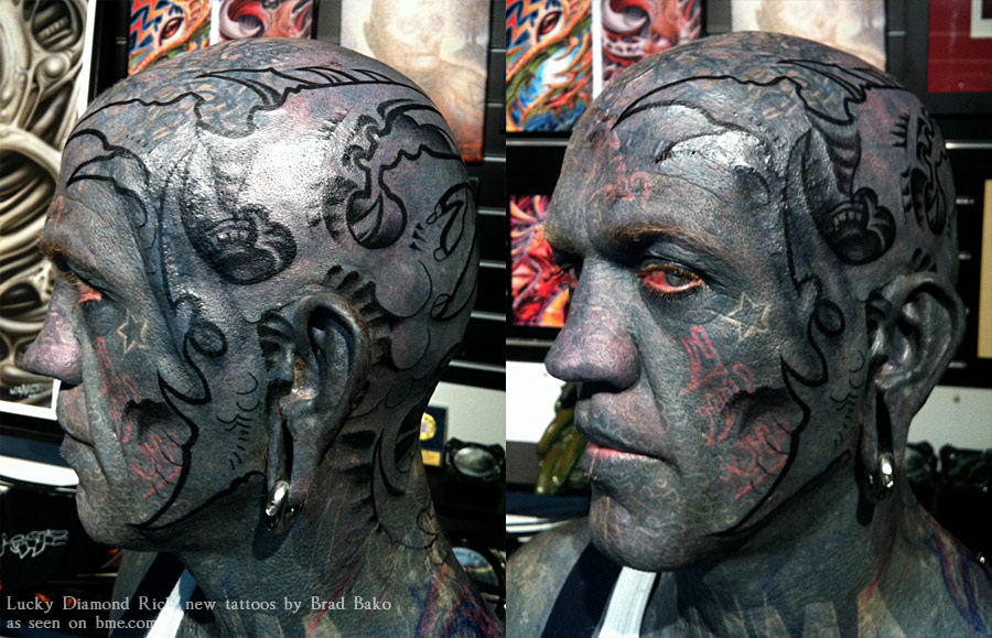
In addition to the bright sleeve work, they are also working on his head, transforming his full-black zen demon sort of appearance into a more traditional biomechanical tattoo icon.
luckyrich-3
So when people ask you the question, “what will you do when you run out of skin”, now you know that you’ll never run out of skin because you can recycle your tattoos. On a side note, I have to admit that it’s rather amazing that 10,000+ years into tattooing that we’re still figuring new stuff out every year.

[Noticias animación] Ya disponibles las primeras imágenes de lo próximo de Dreamworks Animation: 'The Croods'

[Noticias animación] Ya disponibles las primeras imágenes de lo próximo de Dreamworks Animation: 'The Croods':

Pues lo dicho, ya podemos ver un poquito más del próximo proyecto de Dreamworks que nos llegará tras 'El origen de los guardianes'.

La historia gira en torno a
Grug, quien guiará a su mujer, hijos e intratable suegra a través de un entorno espectacular, lleno de criaturas asombrosas, con el fin de encontrar una nueva cueva y hacerla su hogar. Por el camino se encontrarán a Guy, un recién llegado muy creativo e ingenioso que toma todo tipo de riesgos...


Por el momento, el estreno está fijado para el 22 de marzo de 2013, tanto en España como en EEUU.