вторник, 22 января 2013 г.

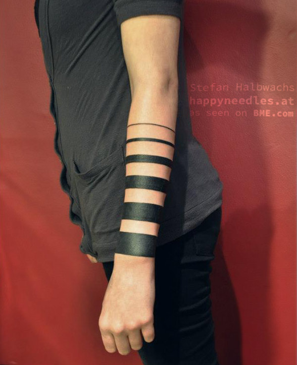
Graduated Blackwork Lines

Graduated Blackwork Lines:
For me, often the simplest tattoos are the most powerful… It’s been my observation that when people imagine themselves, their internal self-image often doesn’t include complex or pictorial tattoos, but heavy, simple blackwork like this almost always integrates on a low level with how the person perceives themselves (and how others perceive them as well). This great example of a simple but unique tattoo was done by Stefan Halbwachs of Austria’s Happy Needles (happyneedles.at).
graduated blackwork

пятница, 18 января 2013 г.

Novelty Stocking Stuffer

Novelty Stocking Stuffer: Santa usually leaves a few novelty item stocking stuffers for me, and this recent Christmas was no exception. Included this time was a pencil sharpener - Geppetto's Pencil Sharpener - Made in China but the brainchild of Israeli design studio Monkey Business.
Package, pencil + point protector, and Geppetto.

The weighted base keeps Geppetto smily face up, even with a long nose.

The sharpener works well, although the blade does not appear to be replaceable.


Also in the stocking, not pencil related.... but then again, perhaps it's a little something to help contemplation on future pencil acquisitions?


воскресенье, 13 января 2013 г.

John Singer Sargent’s Madame X

John Singer Sargent’s Madame X:
Sargent's Madame X

Ever since portraiture become popular among the newly empowered merchant classes in Europe a few centuries ago, it has been common practice for portrait artists in the early stages of their career to paint non-commissioned portraits as examples of their ability.
These are often intended to be striking and memorable, advertising the artist’s capabilities and hopefully achieving wide notice — putting their services in demand.
John Singer Sargent was no exception, though his attempt to paint a dramatic and attention getting portrait of a beautiful American socialite resulted in a simultaneous artistic triumph and societal disaster.
Virginie Amélie Avegno was an American who became Madame Pierre Gautreau, and was known for her beauty and charm. Like Sargent, she wanted greater acceptance in the circles of Parisian society in which she now moved, so she accepted his invitation to pose for her, having turned down similar offers from other painters.
Work on the portrait stretched out longer than either Mme Gatreau or the artist would have liked. There are numerous drawings and studies, and at least one unfinished full size study (now in the Tate, image above, second from bottom).
When the finished portrait was displayed at the Salon of 1884, Sargent had placed his model against a plain background in an unusual pose — her weight partially on a backward turned arm, her body toward the viewer, her head turned in dramatic profile and her skin strikingly pale against the dark background, with the exception of her ear, almost as red as her lips.
She was dressed in a daring black gown, one golden strap of which was off her shoulder.
The painting debuted at the Salon and did indeed garner attention, but the Parisians declared it a scandal rather than a triumph, shaming both artist and model (whose name had been unsuccessfully withheld by the title “Mme ***”).
Sargent, who did not relish this kind of negative attention, repainted the strap on the shoulder instead of off, and renamed the painting “Madame X”, but it did not improve subsequent reception of the work in France.
Sargent gave up on his hope of establishing himself in Paris and moved shortly thereafter to London, where he kept the painting in his studio (above, bottom), not allowing it to be exhibited again for 30 years. Mme Gatreau subsequently had her portrait painted by other artists, like Antonio de La Gandara.
Jonathan Jones, in his column for the Guardian, suggests it was not the painting style, the pale complexion of Mme Gatreau, the stark composition or the dangling strap, but the dress itself, and what it revealed about Parisian high society at the time, that prompted the reaction of scandal.
When he eventually sold the painting to the Metropolitan Museum of Art in New York, Sargent is said to have remarked “I suppose it is the best thing I have done.”
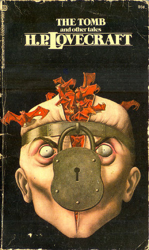
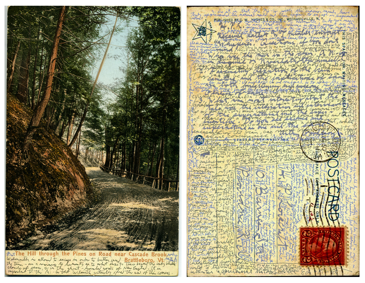
Interview-by-postcard that HP Lovecraft filled in with a sewing needle dipped in ink and a magnifying glass

Interview-by-postcard that HP Lovecraft filled in with a sewing needle dipped in ink and a magnifying glass:


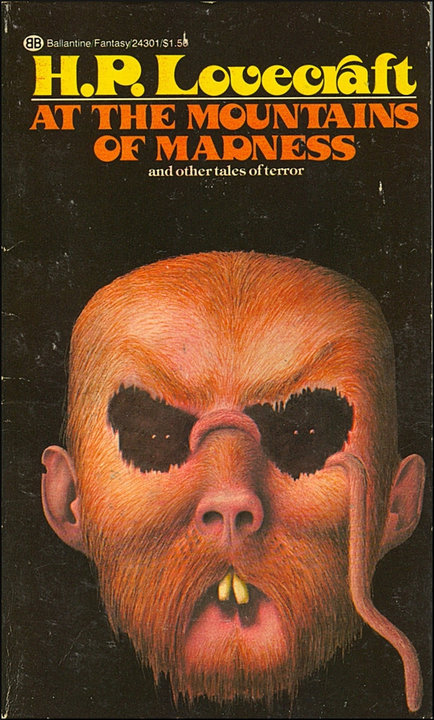
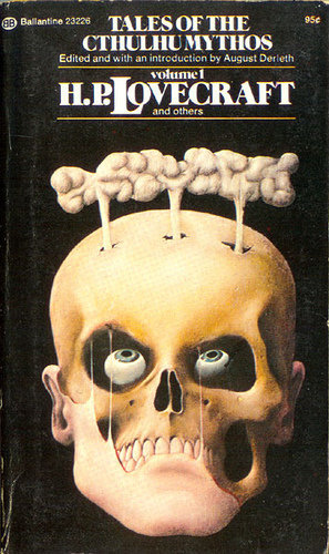
Nick Mamatas (author of such wonderful books as Sensation) formerly lived in Battleboro, VT, once home to amateur press enthusiast Arthur H. Good­e­nough, who was a correspondent of HP "Cthulhu" Lovecraft's. Nick discovered a postcard containing an interview between Good­e­nough and Lovecraft, entirely conducted on a single postcard. Good­e­nough kicked it off by sending Lovecraft a postcard with some questions, and Lovecraft answered them in minute writing in the whitespace on the card, using a sewing-needle dipped in ink, then posted it back to Goodenough. Seriously.


Love­craft was acquainted with Good­e­nough, and Lovecraft’s vis­its to Good­e­nough in Ver­mont in 1927 and 1928 are the basis of his won­der­ful nov­el­ette “The Whis­perer in Dark­ness.” After the story was pub­lished in Weird Tales, Good­e­nough sent Love­craft a con­grat­u­la­tory card, and also asked the author a cou­ple of ques­tions. Rather than respond­ing with a card or let­ter of his own, Love­craft wrote the answers in a tiny hand and then appar­ently gave the card to Vrest Orton — a book­man and even­tual founder of The Ver­mont County Store — who returned the card to Good­e­nough per­son­ally dur­ing a trip to the Green Moun­tain State. Then Good­e­nough sent the card back to Love­craft again, with follow-up ques­tions writ­ten in a nearly micro­scopic hand. I sup­pose he knew the local post­mas­ter, and was able to get the card back into the mail sys­tem with­out a prob­lem. Amaz­ingly, Love­craft man­aged to fit the answers to the ques­tions on the post­card in an even smaller hand. Sher­wood told me that he’d guessed that Love­craft used a mag­ni­fy­ing glass and a sewing nee­dle dipped in ink. Here’s an odd thing; Sher­wood had found the post­card at an estate sale. It had been pro­tected from the ele­ments because it had been used as a book­mark in a 1935 num­ber of The Rev­e­la­tor, and that num­ber was a spe­cial issue ded­i­cated to the “gothic tales” of Isak Dinesen.

I bought the card and kept it with me for years — I moved to Boston, and then to Cal­i­for­nia. Only recently have I been able to spare the time to closely exam­ine and tran­scribe the post­card. It took a few weeks. Lovecraft’s hand­writ­ing was dif­fi­cult to read in the best of times, as I learned in 2007 when writer Brian Even­son took me and my friend Geof­frey Good­win to the library at Brown Uni­ver­sity to check out some of Lovecraft’s papers. If any­thing, Goodenough’s pen­man­ship is even worse, espe­cially in the last unan­swered round of ques­tions. There are a few ink splat­ters on the post­card as well, but only one seems pur­pose­ful, as I make note of below. I took the card to work and abused my pho­to­copy and scan­ner priv­i­leges to blow up sec­tions of the card, then turn them into a series of PDFs. I then zoomed in on the PDFs as much as I could, to turn the tiny let­ters into great abstract shapes, to bet­ter see what we would call “kern­ing” if the text had been typset. To deci­pher this post­card, I not only had to read between the lines, as it were, but I had to make sure I was prop­erly read­ing between the letters.

Mamatas and a friendly googler who specializes in fonts managed to transcribe the card, and the link below contains the whole interview.


Brattleboro Days, Yuggoth Nights

(via JWZ)


humungus:Nazi Uniforms

humungus:

Nazi Uniforms
:


humungus:
Nazi Uniforms

четверг, 10 января 2013 г.

Rob Jones’ Top 10 Posters of 2012

Rob Jones’ Top 10 Posters of 2012:
Torso by Jay Shaw:
Jay is fucking great. I don’t have many Mondo posters on my walls, but I do have this one proudly displayed alongside his works for “Killer Nun” and “Bone’” in my living room.
They Live by Webuyyourkids:
If you don’t like the work of WBYK, then to paraphrase from Lux Interior, “you’re a turd.”  All the work from their recent show gave me eyegasms of varying intensity, but  their poster for “They Live” appears as the cream of a bountiful crop.  I found it interesting that they portray the grim visage of the alien menace only half-covered by an overtly saccharin mask.  I personally interpreted that choice to communicate that the aliens don’t really have to try too hard to disguise their intent AND that the shame lies on us for not violently recognizing them or their quisling servants as opposed to the best interests of humanity.
Psycho by Daniel Danger:
Horror fans are overly exposed to this scenic shot, and it could have turned into a predictable yawn in another’s hands.  However, Daniel really injected his own atmosphere into the familiar image.  He brings it an unsettling new life much like Norman does with his mother’s corpse (if that’s a spoiler, then fuck off and catch up with the rest of us).
The Bride by Craig Drake:
It’s no secret I have a creepy attraction to Elsa Lanchester (in and out of the Bride make-up).  Her multiplied eyes stare out from many of the walls in my home.  Drake’s rendition of the Bride could have easily come off as gothic goof, but instead I really think it translates for normal folks how a monster kid perceives that character with its dark unnatural glamour.  I see her beauty in that make-up as indistinguishable in presentation essence from how the studios would market something straight-sexy like Jane Russell.
The Foghorn Leghorn by Tom Whalen:
Tom’s “Duck Dodgers” poster is technically superior, but this one remains a personal favorite as it reminds me of my dad.  Foghorn is his favorite Looney Tunes character, and as a teenager I often felt like Henery Hawk.  Anyone with a yearning to know more about the creation of Foghorn should definitely check out Robert McKimson’s new book detailing the careers of his father and uncle and all of their enduring creations.
Looper by Martin Ansin:
Very nearly put Martin’s “Tron” on here, but “Looper” just demonstrates such an interesting departure for him in both the illustration style and a next-level composition.
Jodorowsky’s Dune by Kilian Eng:
I’m a sucker for just about anything “Dune”. Eng really hit this one into the parking lot and through the windshield of my shitty Honda with a 1-sheet peek into worlds that sadly never found a true home on film.
King Kong by Laurent Durieux:
Laurent has become a bull-blooded juggernaut with his output this year. The shittiest thing about working with him is choosing from his roughs.  Usually folks send in some ideas, and there’s generally only 1 stand-out.  Laurent, however, always presents a bevy of beautiful takes.  It’s exceedingly difficult not to just say “Great, do them all”.  That was certainly the case with King Kong.  We all loved his rough concepts so much we literally couldn’t choose, and we asked him to bring two of them to final.  I prefer the variant one I think as I thoroughly enjoy the quasi-trompe l’oeil  approach and small accents such as working elements from the film into the curtain pattern.
20,000 Leagues Under the Sea by Ken Taylor:
Well, we knew this would be a big one when the blackline got turned in.  Great composition, color, and phalangeal-powdering attention to illustrative detail.  Ken’s still got the goods…in the flesh pouch that all Australians are born with on their left thigh.
Film by Delicious Design League:
A fairly difficult assignment, but Billy at Delicious Design pulled it off with extreme aplomb caging the struggle between eye and object.

Justin Ishmael’s Top 10 Posters of 2012

Justin Ishmael’s Top 10 Posters of 2012:
Go Ape! by Jason Edmiston
POTA is one of my favorite series of all time and I was super pumped to finally be able to do something with it. We had lots of ideas on how to distribute this poster. One of them was to do a mail order only thing where you would have to send check or money order in with proof of purchase stamps we’d send out when you bought the other 5 posters in the series. Jason Edmiston is one of the most talented (and also nicest) guys working. I love this poster to death and the original painting is even on my wall at home.
Bullhead by Jay Shaw
This was a total “How’d he do that?” moment for us when we got this in our inbox. We all just thought he found some picture and photoshopped it, but no. This is drawn. Just goes to show how talented Jay is.
20,000 Leagues Under the Sea by Ken Taylor
Super classic poster from Ken. I never get tired of seeing Ken’s work. Way before we got the license I remember watching this movie with an old roommate and saying how amazing it would be to have a Nautilus/ Squid fight poster and it finally came true!
The Cabin in the Woods by Phantom City Creative
What a fun poster to work on this was. We got to see the movie early, but the only bad part was we couldn’t, with good conscience, do anything in the poster that would give anything away. Looking back, it was definitely a good thing to have all of the caveats around doing this poster as we had to get super creative on what to do with it. We got second place this year in The Hollywood Reporter’s Key Art Awards. We’ll go for the gold in 2013.
The Iron Giant by Laurent Durieux
This poster is just beautiful. THE IRON GIANT is one of the movies that still make me cry and this poster evokes that same emotion from me.
Jodorowsky’s Dune by Kilian Eng
I cannot wait for this documentary to come out. We were so thrilled that this poster got such a great response. Killian Eng is one of my favorite artists right now and he does science fiction better than almost anybody.
Shaun of the Dead by Jock
Jock is just the best. His ideas are so good and the variant on this poster was definitely one of the best of the year. We got to see the original drawings for this poster when we were at Thought Bubble in Leeds and it was amazing. I can’t wait to see more work come in from him.
Halloween by Ken Taylor
Probably Ken’s best poster of the year. It nails the tone so perfectly. This was for a charity event at the New Beverly and even “The Shape” and John Carpenter were impressed by it!
Creature from the Black Lagoon by Francesco Francavilla
I can’t remember the first time I saw Francesco’s work. It was, I’m sure, his covers for Marvel. Maybe like BLACK PANTHER or something, but I started to hunt down and grab covers that he did. It was awesome to not only get him on a poster, but to have him at the booth at SDCC and for him to win the Eisner award for best cover artist that same night!
Psycho by Daniel Danger
I remember we did a process video with Daniel on COWBOYS AND ALIENS and we should make a point to do that every time. His work is so beautiful and the process is equally as exciting. I would’ve loved to see his hand swollen up after all of the cross hatching on this thing.